Reebok
SERVICES:
Campaign Identity, Creative Direction, Graphic Design
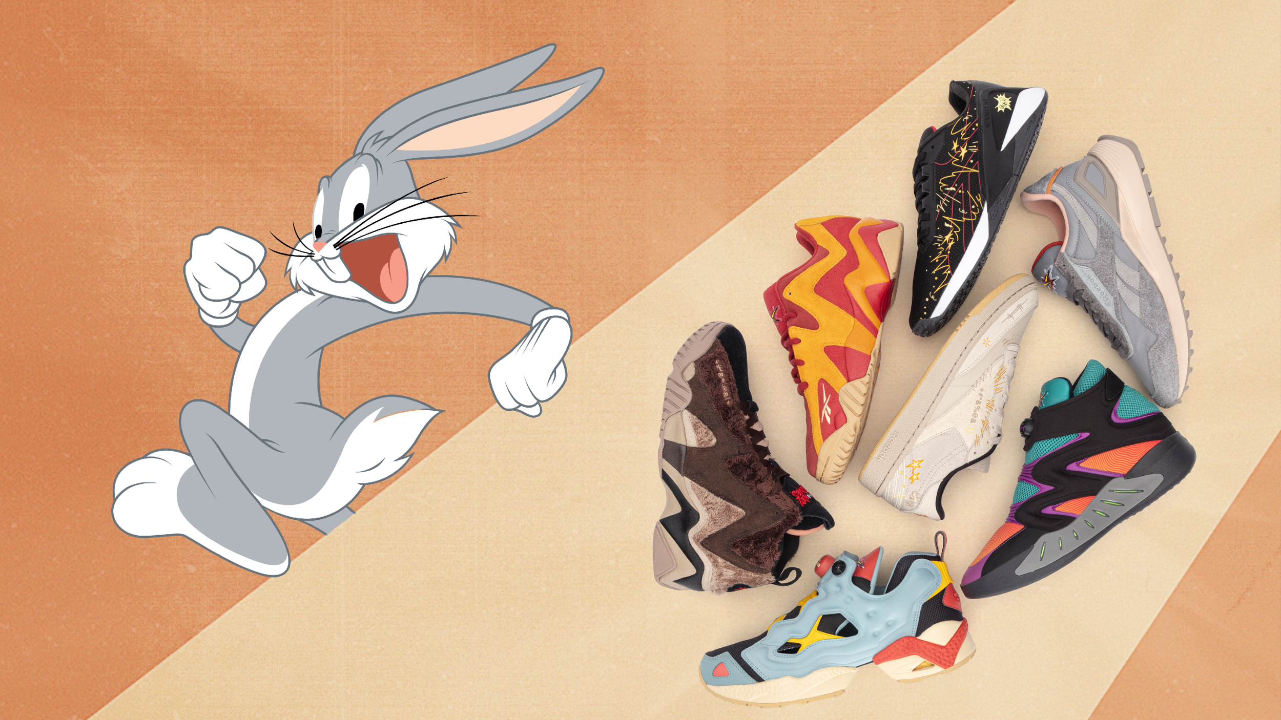
To aid Reebok in the launch of their upcoming collaborations with Warner Bros., we developed a campaign identity and built out all the branding assets needed across an array of digital channels. The catch was we needed two campaigns—one for The Jetsons Meet The Flintstones & one for Looney Tunes—each with their own unique identity but there also needed to be a familial feel between them both. We needed to meaningfully and cohesively merge all these properties, with all these characters that exist in all these different worlds,across different time continuums. So we connected everything through something universal, that was both timeless and ageless; we united the campaigns through classic, enduring style.
ROLL CREDITS
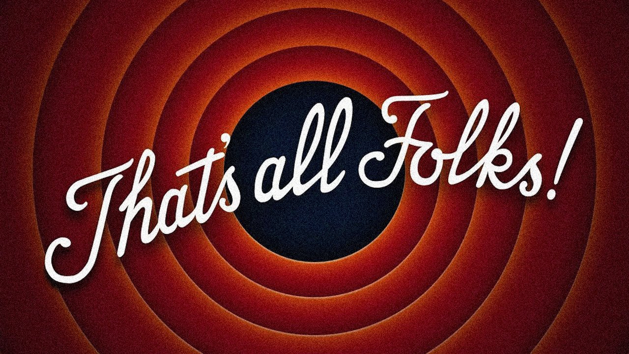
The Mid-Century Modern aeshetic was the connective thread that existed throughout all these cartoons. This was especially apparent in the end credit and background design. We pored over vintage Warner Bros. and Hanna-Barbera production cels and credit sequences from that era in an effort to authentically reinvent the artistic craftsmansip that went into this illustration and animation. There’s a graphic simplicity wrapped in a textural richness that brings us right back to those Saturday mornings in front of the TV.
SETTING THE STAGE
While the WB rings are about as iconic as it gets, that wasn’t going to translate to The Jetsons & Flintstones. But in revisiting all these worlds, we uncovered how much the creators were leaning into the aesthetic ideals of their time. From the furniture to the costumes, everything has a touch of mid-century modern flair. We brought that thinking to our brand design and used it as the visual foundation for both campaigns.
REINVENTING ICONIC STYLE
We enriched the campaign stories by recreating the textural warmth & saturated fuzziness of those credit sequences and production cels from yesteryear. We tapped into the heritage of these classic animation studios by creating a Reebok-branded version of the approval production credits found on those old title cards. We used modular shapes to create dynamic and to help spotlight our focus: the product. Each campaign got its own shape design to keep the campaigns visually distinctive. Additionally, we used to Reebok’s existing brand typography to help further marry the collaboration. Copy was written to reflect the tone of the shows and their characters, which allowed these already “larger-than-life” voices to do a lot of the verbal storytelling.
A REEBOK PRODUCTION
In creating the collab logo lockups, we ran into a unique issue as it related to the Jetsons x Flintstones collection. Instead of combining two logos—typically accomplished with some version of an ‘X’ as the multiplier of the brands—we needed to merge three logos: the two shows plus Reebok. Our solution was using the Reebok Vector logo (which holds the shape basic shape & movement as an ‘X’) as the stand-in for the conventional lockup link.
Commissioned by M&C Saatchi Sport & Entertainment. © Hanna-Barbera & Warner Bros. Entertainment


